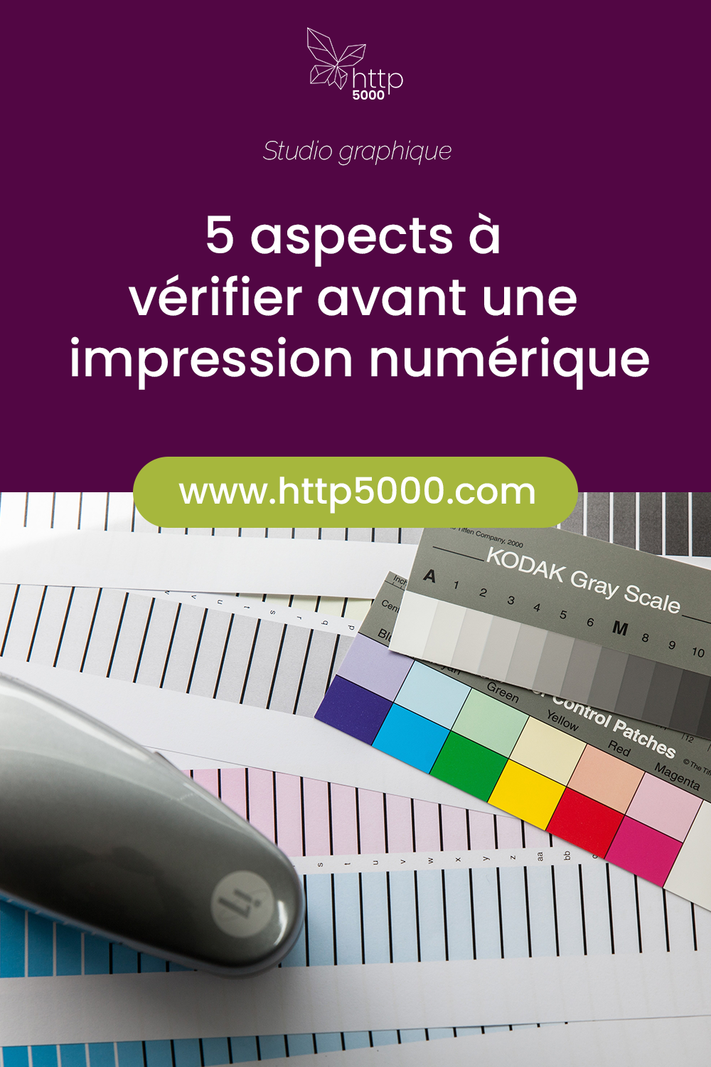
5 aspects to check before digital printing
For a flyer, a brochure or a business card, the choice of printing method matters. Your decision will open up certain possibilities and close off others.
Here are 5 essential points to consider before opting for digital printing — 5 pitfalls to avoid.
Visual misalignment
On a digital press, there is neither a sheet feeder nor any mechanical correction.
The image reaches the paper as-is, without having been adjusted by the machine as it would be on an offset press.
As a result, the image can shift, slip, or tilt. The average precision is plus or minus 1 mm per side, or 2 mm between the front and the back.
It is therefore important to supply artwork that is generously sized, with at least 4 to 5 mm of bleed free of text or graphic elements at the edges.
Good to know: the heavier the paper weight, the more rigid the sheet and the greater the risk of image misalignment.
Darker shades
Laser printing uses a very fine powder (toner) which is deposited by static electricity onto a drum and then fused in an oven.
It is therefore an opaque process that covers the paper entirely.
As a consequence, you should avoid overlay and transparency effects, which will come out darker than expected.
Solid colour backgrounds do not print uniformly and their shade can vary from one page to the next — grey in particular.
Gradients may exhibit an unpleasant banding effect.
Similarly, there is no point in choosing a creative, textured paper if you are printing a solid colour block digitally: the paper will no longer be visible beneath the colours. If you are using a textured paper, plan for white areas to let it show through.
Smooth surfaces
Digital printing works, as we have seen, with a powder that is fused by heat. The result is particularly smooth with a glossy finish that catches the eye.
The downside of this finish is that you should avoid laying a solid colour block too close to text. The block can bleed, which is why it is important to leave clear white zones around text.
The same applies to any areas that will be folded: avoid placing a solid colour block at those points.
Varying shades
Colours can vary depending on the ambient temperature and the substrate used. Over several days, the same print run may therefore yield slightly different shades.
For uniform quality, opt for offset printing.
Good to know: vivid colours reproduce well with digital printing; for pastels, overlay effects and gradients, offset is the preferred choice.
Illegible text
Plan for text that is bold enough to reproduce correctly in digital printing. If the type is too fine, it may appear "dirty" — yellowish rather than clean white.
So, digital or offset for your next print run?
YOU MAY ALSO LIKE
UGC, the future of marketing: How user-generated content can revolutionise your marketing strategy
by Yumea, 7 March 2023
UGC (User Generated Content) is changing the game in the world of marketing. With the rise of social media and content-sharing platforms, the … READ MORE
Category: News , Getting visible online , Social media
Comments: 0
How to use Instagram to reach your audience and drive traffic to your website?
by Yumea, 1 February 2023
Social media has become an indispensable tool for businesses looking to reach their target audience and drive traffic to their website. With more than 3.8 billion active users … READ MORE
Category: Getting visible online , Instagram , Social media
Comments: 0
7 Artificial Intelligence (AI) tools to know in 2023
by Yumea, 12 January 2023
In 2023, there are many platforms using artificial intelligence (AI) to help users write content and generate images. If you are looking for tools to help you write … READ MORE
Category: News
Comments: 0
Have a similar project?
Let's talk it over in 15 minutes. No sales pitch, just a technical chat.