SMEs: 3 web design principles for a successful website
When you do not have the same command of web design as a professional in the field, it is easy to feel stuck. But fear not, because there are effective and straightforward methods for achieving good web design regardless. Today, we offer you 3 practical tips and pieces of advice to help you find your footing.
1. The rule of thirds
One of the most widely used practices in mastering web design, graphic design, print, and even photography, is the rule of thirds. In other words, it is about taking symmetry and balance into account. The aim is to achieve purity and harmony in your design by applying this rule of thirds to your graphics, images, web layouts, and much more.
It is worth knowing that in design, if an image or visual is too similar in the left and right halves, or in the upper and lower halves, the viewer (in this case, the internet user) will find it difficult to be drawn in by what they see. The rule of thirds breaks with this principle to make the visual appealing and balanced through a grid system. Here is how it works:
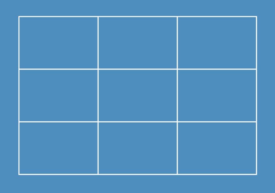
This "imaginary" grid over your image helps you identify the main intersection points for positioning your image in the best possible way. You will notice 4 intersection points that help to balance your visual. To give you an example, you can see below a visual that does not follow the rule of thirds, compared to one that does on the next image.


The conclusion is clear: it is more pleasing to the eye to see a result that respects the rule of thirds, even if we tend to overlook it. Instinctively, your eyes always align more easily with the intersection points, which makes the visual more comfortable to look at.
2. Layout and flow
When it comes to web page design, there is no such thing as a definitive "good" or "bad" style. It depends on the project at hand, your clients' needs, your graphic signature, and the target audiences involved. In recent years, the minimalist and clean style has dominated. Viewers' eyes need space and simplicity to avoid being overwhelmed with detail and to make the browsing experience more pleasant. But since design must respond to different criteria, such as the type of market targeted by the owners of a website, it is always important to rely on objective thinking.
For example, a law firm's web page will not have the same design as a children's toy maker's page.
It is also important to consider the principle of the audience's "eye flow". Everything depends on where your page wants to lead the internet user (a call-to-action button, a video, a contact link, etc.). Generally, the Z pattern is the most commonly applied model. The eye starts at the top left of the page and follows a Z-shaped movement, ending at the bottom right of the page. Your visuals and important elements should therefore not be placed randomly, but strategically positioned along this Z.
3. Visual hierarchy
Visual hierarchy helps the user identify the most important information in the design and provides clear direction for where the viewer's eye should go.
It is often referred to in the context of typography, but can also be vital in graphic elements, images, or the overall site design. You have probably found yourself on sites that have text and images all at the same size, with no visible CTAs. It is best to avoid this kind of design if you want to capture internet users' attention on a page!
The most important elements of your site should therefore be the most visible. Think of a newspaper article: you have the bold headline, clearly visible and often followed by an image positioned just below. Then a much smaller introductory text, in bold. And finally the body copy — the article itself — often laid out in columns in a printed newspaper. This is a perfect example of visual hierarchy: the bold headline and the photograph catch the eye, set the tone, and indicate the subject. If this step convinces the reader, if the subject interests them, they move on to the introduction, which summarises the matter. Only then will the reader go on to read the full article if the two preceding stages (headline and introduction) have engaged them.
A website works in exactly the same way. Your internet users will not consume all your content: they will not read all your text or visit all your pages. They will only go to the content that interests them. Visual hierarchy helps them do exactly that, showing them where to look and sorting content on their behalf.
We hope these 3 web design principles will help you think more clearly about your site and make it even more effective.
YOU MIGHT ALSO LIKE
UGC, the future of marketing: How user-generated content can revolutionise your marketing strategy
by Yumea, 7 March 2023
UGC (User Generated Content) is changing the game in the world of marketing. With the rise of social media and content-sharing platforms, the ... READ MORE
Category: News , Getting visible online , Social media
Comments: 0
How to use Instagram to reach your audience and drive traffic to your site?
by Yumea, 1 February 2023
Social media has become an indispensable tool for businesses looking to reach their target audience and drive traffic to their website. With more than 3.8 billion active social media users worldwide ... READ MORE
Category: Getting visible online , Instagram , Social media
Comments: 0
7 Artificial Intelligence (AI) tools you need to know in 2023
by Yumea, 12 January 2023
In 2023, there are many sites that use artificial intelligence (AI) to help users write content and generate images. If you are looking for tools to help you write ... READ MORE
Category: News
Comments: 0
Have a similar project?
Let's talk it over in 15 minutes. No sales pitch, just a technical chat.