8 outdated web design trends to absolutely avoid on your site
Fashion comes and goes every year. Who has never looked at a photo taken in the nineties and thought, "How could anyone have worn clothes like that?"
The internet is no exception to this rule, and website design has undergone many changes over the years.
New trends enter the arena, and their predecessors become obsolete — even counterproductive to a site's proper functioning. And on the web, this happens ten times faster than with clothing, which is itself subject to relatively fast-changing fashions!
The following article lists 8 such web trends that have had their moment in the spotlight but now need to be consigned to the archives. Some for purely aesthetic reasons, others because they clearly hinder the conversion of visitors.
1. Carousels
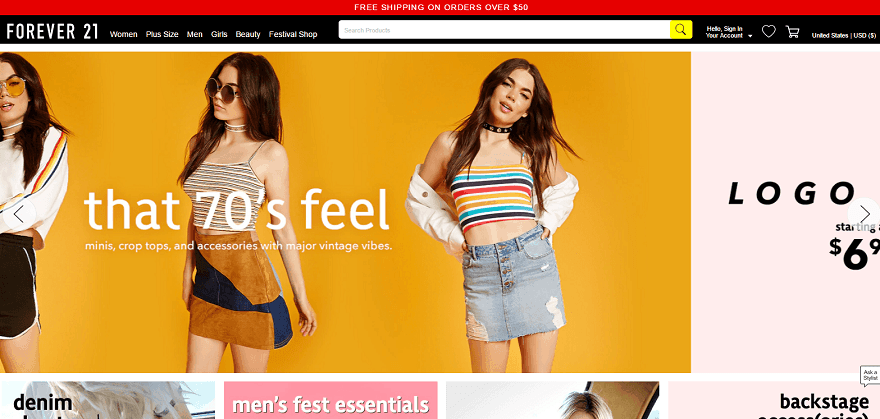
While they are far less common nowadays, carousels can still be found on many websites. Yet this practice is often targeted by web critics — some people even create parody sites on the subject.
But why should carousels be avoided? Mainly because nobody clicks on them and they make content difficult for visitors to find.
Carousels that include a call-to-action button perform better than those that do not, but should still be avoided where possible.
The subject has indeed sparked a great deal of debate online:
- Erik Runyon's analysis of a university website shows that only 1% of visitors click on the carousel. The vast majority of those clicks are on the first slide.
- The Nielsen Norman Group found that when a visitor is looking for particular content, they cannot read it because of the carousel's auto-scrolling.
- Wider Funnel demonstrated that carousels do not convert, and explains why on their site (article in English).
In short, carousels distract and confuse visitors. They do not convert, which makes them useless — or even counterproductive — particularly for e-commerce sites.
In practice, this does not necessarily mean abandoning carousels altogether. But you should not rely on them for conversions, and you should avoid auto-scrolling that moves too fast.
2. The Parallax effect used to excess
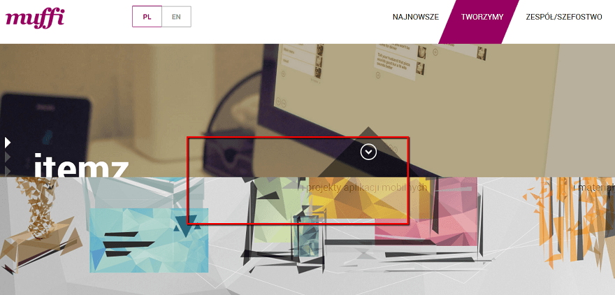
The Parallax effect is a sublime web design effect in the hands of a professional. It means that as a visitor scrolls down a page, the background image remains fixed or scrolls more slowly than the content.
Used tastefully and sparingly, this visual effect can add a sense of depth to a site. However, it is now included in many WordPress themes — in short, it is used to excess, everywhere and for everything.
So when should you use a parallax effect? A study shows that visitors find sites with a parallax effect "more fun." This makes it an effect ideally suited to lighter, more casual sites.
On the other hand, participants in the study also reported "significant usability issues" stemming from a feeling of nausea due to the parallax movement.
The Parallax effect does not need to disappear entirely, but it requires careful attention and relevant, purposeful use.
3. Photos that are clearly sourced from stock image libraries

Of course, using stock image libraries is unavoidable for everyone and is not particularly problematic in itself.
But it is important to avoid making it too obvious. For example, a photo of the same person reused by 50% of websites for their help page. Or photos that are too "stereotypical," with characters smiling as if their lives depended on it whilst staring directly into the camera.
Why should this be avoided? Because this type of image undermines a site. It breaks the illusion and alerts the visitor: "this is a royalty-free photo taken from the internet — you will clearly not experience the same atmosphere with this brand as in these images."
Without banning such images entirely, they should therefore be used judiciously:
- Only choose high-quality images
- Avoid overly clichéd images that appear too "staged"
- Use royalty-free images only when you have no other options
4. Intrusive pop-ups
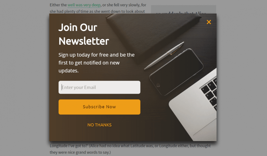
This one is notoriously well known. Pop-ups that take over visitors' entire screens — for a promotion or a newsletter sign-up — remain commonplace today. Yet Google continues to take action against this practice, particularly on mobile devices.
Despite this, pop-ups are widely used, especially on marketing sites. Why? Partly for conversion reasons: webmasters believe that a newsletter pop-up, for example, will generate more sign-ups. And this may be partly true. But these pop-ups primarily damage the user experience and drive more than a few visitors away.
To truly create a site that visitors will enjoy browsing, abandon this type of pop-up. Opt instead for more discreet pop-ups (a small corner message for a newsletter sign-up request). Or no pop-ups at all for mobile versions. From an SEO perspective, Google "penalises" pop-ups that cover the entire phone screen. While some are tolerated, there is little point in tempting fate.
5. The Hamburger menu on desktop
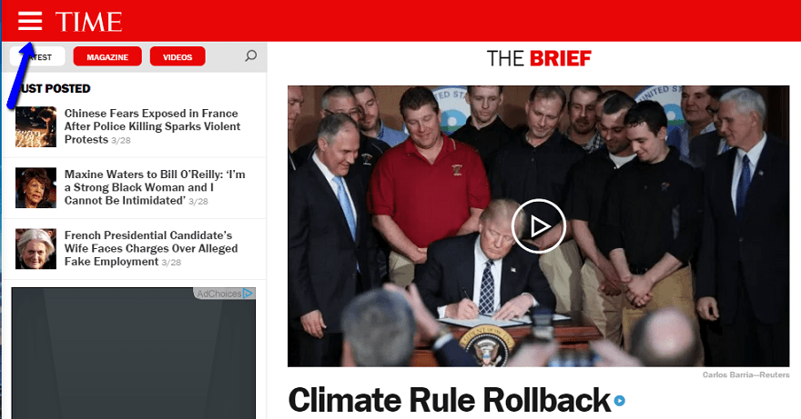
The Hamburger menu is the name given to the icon consisting of 3 horizontal bars. When clicked, it expands the navigation menu.
On mobile, this type of menu makes perfect sense: discreet, it takes up no unnecessary space, and mobile users now recognise it without any difficulty as the entry point to the menu. There is nothing to object to on that front.
On the desktop version of a site, however, it is a different matter entirely.
Many have tried it — no doubt in pursuit of minimalist design and clarity. Yet it is completely counterproductive in that regard. Visitors are thus "forced" to click one extra time every time they want to navigate to a section of the site. This ties directly back to the famous 3-click web design rule: if a visitor has to click more than 3 times before reaching the content they are looking for, that is a problem — and it significantly increases the chances of them giving up and going elsewhere.
The Hamburger menu is thus needlessly adding one extra click. Consider a regular visitor to your site and multiply the number of additional clicks and added waiting time — all for no reason.
A classic horizontal or side menu will provide a far better user experience. If the menu is genuinely very long, opt for a two-tier menu or, at a stretch, a dropdown menu. But the Hamburger menu is truly to be avoided on any site designed for desktop use.
6. Extreme minimalism, or the lack of signposting
Creating a minimalist site seems like a good idea at first glance. No frills — the visitor can get straight to the point. But the risk is taking things too far and being minimalist for its own sake.
Rather than striving for minimalism, think instead about simplicity. A simple site allows visitors to get to what matters and reduces web friction (referring to anything that can impede a visitor's journey). But simple does not necessarily mean minimalist.
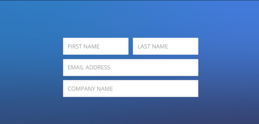
For example, some web designers, in a desire for minimalism, removed the title from their contact form. While this seemed like a good idea at first, they quickly found that it confused users. Was the form for a contact request, a quote request, or a newsletter sign-up? In this concrete case, minimalism created a lack of clarity — and ultimately, less simplicity. Leaving a title above the form provides guaranteed simplicity and, without going to minimalist extremes, in no way hinders the user experience.
7. Too many columns or widgets
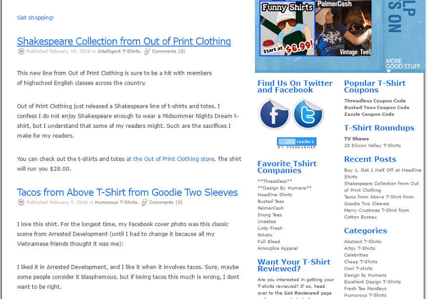
One of WordPress's qualities is the enormous ability to add widgets and sidebars to your site.
Again, this is not a problem in itself — it is even an advantage. But excess is never far away, and as always, it is counterproductive.
This could be compared to impulse buying in a shop. You go in to buy a specific book and come out with ten. The temptation is all the greater on WordPress, where a single click is enough to add dozens of additional modules.
It is therefore important to focus on what is essential. Too many widgets will give your site a cluttered, chaotic appearance.
8. Too many fonts for no apparent reason
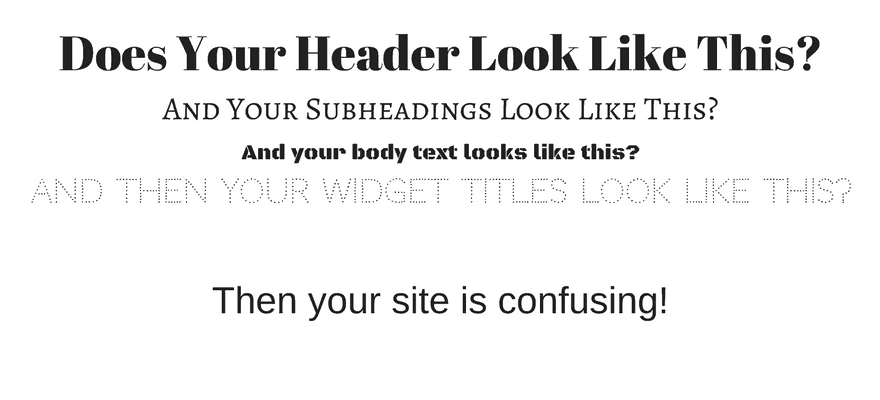
Many designers create superb new fonts every day. As with widgets, it is therefore easy to feel like a child in a sweet shop. But a font being beautiful is not sufficient reason to include it on your site.
With a harmonious arrangement, two or three different fonts can enhance your design. Beyond three, however, your site will become confusing and difficult to follow.
Like all rules, this one has exceptions — you can find sites that combine more than three fonts without any problem. But most of the time, especially if you are not a professional web designer, this will represent an excess that will diminish the readability of the site and therefore the user experience.
Of course, this article may well be out of date in a few years' time — perhaps even a few months. The outdated trends mentioned above will fade from collective memory, and new ones will take their place. But taking stock of the subject can always be beneficial and help to avoid certain web design mistakes.
(Freely adapted from Elegentthemes)
YOU MAY ALSO LIKE
UGC, the future of marketing: How user-generated content can revolutionise your marketing strategy
by Yumea, 7 March 2023
UGC (User Generated Content) is changing the game in the world of marketing. With the rise of social media and content-sharing platforms, the... READ MORE
Category: News , Getting visible online , Social media
Comments: 0
How to use Instagram to reach your audience and drive traffic to your site?
by Yumea, 1 February 2023
Social media has become an indispensable tool for businesses seeking to reach their target audience and drive traffic to their website. With more than 3.8 billion active users... READ MORE
Category: Getting visible online , Instagram , Social media
Comments: 0
7 Artificial Intelligence (AI) tools to know in 2023
by Yumea, 12 January 2023
In 2023, there are many sites that use artificial intelligence (AI) to help users write content and generate images. If you are looking for tools to help you write... READ MORE
Category: News
Comments: 0
Have a similar project?
Let's talk it over in 15 minutes. No sales pitch, just a technical chat.