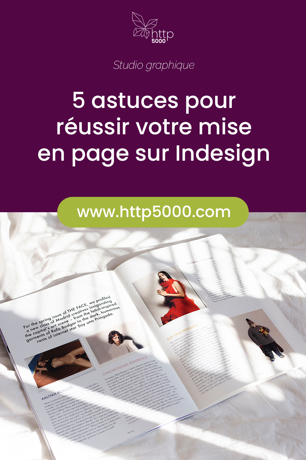
5 tips for successful layout in InDesign
This article is aimed at graphic designers who use InDesign for their layouts. Maintaining consistency throughout a large document — or across several documents that must adhere to the same brand guidelines — can be difficult and time-consuming. In this article we list a few tips and best practices to make the task easier.
1 – Keep it simple
The best designs — the most timeless or the most refined — are often deceptively simple. Do not be afraid to keep things simple just because you want to be original. Complex and original are two very different things, and the readability and effectiveness of your documents will suffer if you over-complicate them.
When an existing brand identity is not imposed on you, create a simple one. Taking the time upfront to do this work will save you a great deal of time later and make decision-making easier on countless small details. This brief style guide can include the following elements:
- Colours. In addition to black and white, choose 1 or 2 colours (drawn from the logo or its complementary colour, for example) and develop them in 2 or 3 tones (light, medium, dark). You will then have a simple palette of a maximum of 6 colours throughout your document. This will strengthen its coherence and readability.
- Typefaces. Use a maximum of 2, or at most 3, typefaces, and always use the same typeface for a given function (always the same one for headings, always the same for body text, for captions, etc.). As with colours, you make the reader's job easier by familiarising them with recognisable patterns, which improves the readability and consistency of the document(s).
- Graphic style. Define a graphic style and a tone to maintain across all materials. Build a small library of graphic elements (icons, textures, dividers…) that you can reuse from one document to another.
2 – Use master pages and styles
Among the most useful tools in InDesign are master pages and styles (paragraph, character, object styles, etc.). These tools prove invaluable especially for complex, multi-page documents. Create one or more layout master pages according to your needs, and apply them to all your pages: you will save an enormous amount of time by not having to re-lay out recurring elements, and you will avoid many oversights and errors.
Create a few paragraph, character and optionally object styles so that you no longer need to think about the formatting of your text.
Here again, the aim is to do the groundwork upfront — to invest a little time in preparation that you will quickly recoup during the actual layout process.
For master pages, one per section can be useful, but if your document is fairly simple, a single general master page for the whole document will suffice.
For paragraph/character styles, here are those I typically create (depending on the document, you may need far fewer or many more):
- Heading
- Sub-heading
- Section heading
- Introductory paragraph
- Body text
- Quote / Emphasis
- Byline
- List
- Footnotes
- Legal notices / Photo credits
3 – Use white space
To allow your documents to "breathe", remain readable without discouraging the reader, and maintain a clear information hierarchy, limit the number of elements on a page and use white space wisely. There is no point in trying to fill a page with information at all costs. It is better to have 2 clear, readable pages than a single overcrowded page where nothing stands out and the reader does not know where to start.
In practice, this translates as follows:
- Use generous margins and gutters. Whilst images and graphic elements may bleed to the edge, use wide margins and gutters for your text.
- Limit the number of images. Whether illustrations or photographs, favour one or two large, striking images over a multitude of postage-stamp-sized pictures that will be illegible, clutter the view and weigh down the layout. As discussed in the previous points, use images that are coherent and harmonious with each other and with the tone of the document.
- Lay out using imposed spreads. If you are laying out a flyer or a folded leaflet, have one spread for the front and one for the back. If you are laying out a brochure, work with facing pages. Having an InDesign document that reflects what the finished piece will look like helps you create a smoother, more readable layout. It will also be necessary when generating a correct print-ready PDF (see our article on this subject).
4 – Package your document
For every finished document, remember to create a package, so that you have a folder containing all the linked files — and only the links actually used — as well as all the fonts — and only the fonts actually used. When you pass your work on to other designers or to the printer, or when you revisit the document much later, it will be far easier to modify and reuse.
In conclusion
Take the time to set up your file properly in advance, be rigorous and organised during the creation process, and think about future users when you finish the document. Always keep the end user in mind and make life easy for them: do not overload the presentation, stay consistent to build reading habits, create a clear reading flow in your layout, and use white space to allow your documents to "breathe".
I hope these few tips and tricks are useful if you are not already applying them. This article is not an exhaustive course in layout and should not constrain you — keep your creativity while applying this guidance and you will produce outstanding documents that will impress every time!
YOU MAY ALSO LIKE
UGC, the future of marketing: How user-generated content can revolutionise your marketing strategy
by Yumea, 7 March 2023
UGC (User Generated Content) is changing the game in the world of marketing. With the rise of social media and content-sharing platforms, the … READ MORE
Category: News , Getting visible online , Social media
Comments: 0
How to use Instagram to reach your audience and drive traffic to your website?
by Yumea, 1 February 2023
Social media has become an indispensable tool for businesses looking to reach their target audience and drive traffic to their website. With more than 3.8 billion active users … READ MORE
Category: Getting visible online , Instagram , Social media
Comments: 0
7 Artificial Intelligence (AI) tools to know in 2023
by Yumea, 12 January 2023
In 2023, there are many platforms using artificial intelligence (AI) to help users write content and generate images. If you are looking for tools to help you write … READ MORE
Category: News
Comments: 0
Have a similar project?
Let's talk it over in 15 minutes. No sales pitch, just a technical chat.