Which colours to choose for your website: psychology, symbolism, and the meaning of colours in web marketing
Understanding what each colour signifies, and what it evokes in the collective unconscious, is essential to making the right choices in your marketing, your communications, and more specifically for your website. What values do you want to convey? What atmosphere do you want to create? What brand image do you wish to project?
Here is an overview of colours and their meanings — of which there are many, depending on the context — within our culture, to help you see things more clearly.
Each colour has several meanings, which vary according to its shade and the culture in question. This is therefore intended as a broad overview to help you gain clarity. You will then be able to select your tones with full knowledge, and adapt them to your brand according to the desired final result.
Red: intensity, power, excitement, and action

What does this colour mean? How is it perceived in our culture? Red is an intense colour with many facets. It is the colour of fire, love, warmth, authority, power, excitement, blood, desire, and sexual tension. It can also evoke the opposite: danger, anger, and violence. In either case, it is a colour that gets noticed.
Indeed, by virtue of its intensity, it is one of the colours that best captures attention and is most likely to be remembered. Red therefore helps to delineate spaces or highlight visual elements effectively.
As a colour of action, it lends itself particularly well to call-to-action buttons, encouraging purchases online.
Darker shades of this colour can create a warm atmosphere. In your marketing, well-placed touches of red will draw attention to the most important aspects of your website, your advertisements, and your visuals.
A few brands that use this colour, by way of example: Coca-Cola, McDonald's (before moving to a predominantly green palette), Nintendo, YouTube, Netflix, KFC, Lego, Mattel.
Orange: warmth, optimism, energy, and good health

What does orange mean in the collective unconscious? Orange is a vibrant colour that evokes sunsets, fire, and broadly speaking, everything connected to the earth, positive energy, and good health. This colour is rather special in that, at first glance, it does not blend easily with other tones. However, its joyful, warm quality makes it an excellent candidate for establishing a human and positive atmosphere.
Furthermore, this colour is well known, like red, for stimulating appetite. For a food or culinary brand, it is a must — and it is not uncommon to find this shade in restaurants.
A few brands that use this colour, by way of example: Fanta, Orangina, Firefox, Amazon, Orange, Arte, EasyJet.
Yellow: joy, youth, stimulation, and creativity

Yellow is one of the clearest and brightest colours for the human eye. Indeed, it is the most visible shade in the spectrum. This joyful colour stimulates excitement and conveys a sense of happiness. After all, it is the colour of the sun, of youth, of creativity, and of fun. It is the colour of optimism.
However, in our culture, this shade is also associated with cowardice, betrayal, and madness. Is it not said that yellow flowers are given as an apology after infidelity? Like all colours, yellow therefore carries a paradox in the collective imagination. But in a marketing context, it is firmly the joyful side that wins out. Many famous brands use it, paired with a friendly and optimistic brand image.
Like red, yellow can help draw attention to the desired areas. Use this tone to highlight certain elements, such as a call-to-action button. Take care not to use too much yellow, however: the idea is to add touches that make your most important elements stand out. While yellow attracts attention, it can also be distracting if overused.
Moreover, combining white with yellow tends to make the yellow disappear. If you wish to use yellow to highlight something, it is best to pair it with darker tones, to clearly mark the contrast.
A few brands that use this colour, by way of example: Nikon, UPS, Subway, Schweppes, Ferrari, Ikea.
Green: nature, health, calm, and growth
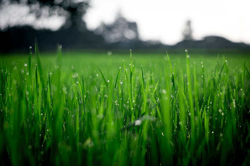
No one will be surprised to hear that green is by definition the colour of nature. Indeed, this combination of blue (like the sky) and yellow (like the sun) naturally evokes trees, grass, and nature in general. As such, it is the shade that best conveys ecological concerns.
Through the association we make between this colour and nature, this shade tends to soothe the mind. It carries strong associations with tranquillity, rest, and fertility.
It also lends itself to ideas of growth, development, and renewal through its lighter shades.
Furthermore, green also has a financial connotation — it is the colour of dollars. As a result, this shade evokes health and the world of finance. A brand in this sector therefore has every reason to draw on this colour.
However, green can feel overwhelming if overused. It is therefore best used sparingly. Additionally, the combination of green and orange is widely regarded as one of the most off-putting colour pairings in existence, so it is generally advisable to avoid this combination.
A few brands that use this colour, by way of example: Tropicana, Starbucks, Android, McDonald's (more recently), Aer Lingus, Organic Agriculture, Crédit Agricole, BNP Paribas.
Blue: serenity, trust, creativity, and rest

Blue evokes oceans and skies, and therefore conveys a feeling of calm and serenity.
This colour is considered one of the most popular, best-loved, and most widely used. After all, 70% of the Earth's surface is water, giving our planet a predominantly blue appearance. This shade, which evokes nature and calm, naturally resonates in the collective imagination.
As the colour of rest and tranquillity, it is associated with seas and oceans, and therefore indirectly with beaches and water-based leisure. It conveys a sense of relaxation and ease, making it ideal for a brand looking to establish and maintain a soothing image.
Blue also evokes loyalty and trust. This combination of meanings may explain the widespread use of this shade amongst certain banks and particularly popular brands such as Microsoft, Facebook, LinkedIn, and Twitter.
The darker shades of this colour convey professionalism, expertise, authority, and sincerity. Our culture also attributes a creative quality to this shade: it is said to stimulate the imagination.
Like all colours, blue also has a negative side. It is associated with coldness and depression — the blues musical genre, after all, is built on melancholy, as its very name suggests.
Despite this aspect — which a brand can easily overcome by projecting a relaxing image and building trust with its customers — blue is an ideal dominant colour for a website or brand visual. In a world that is moving ever faster and placing ever greater stress on users, a calming brand is more than desirable.
A few brands that use this colour, by way of example: Dell, HP, Twitter, Facebook, NASA, Skype, Ford, Nestlé, BMW, Decathlon, Gillette, Intel, Ibis Budget.
Purple: nobility, mystery, sensuality, and elegance
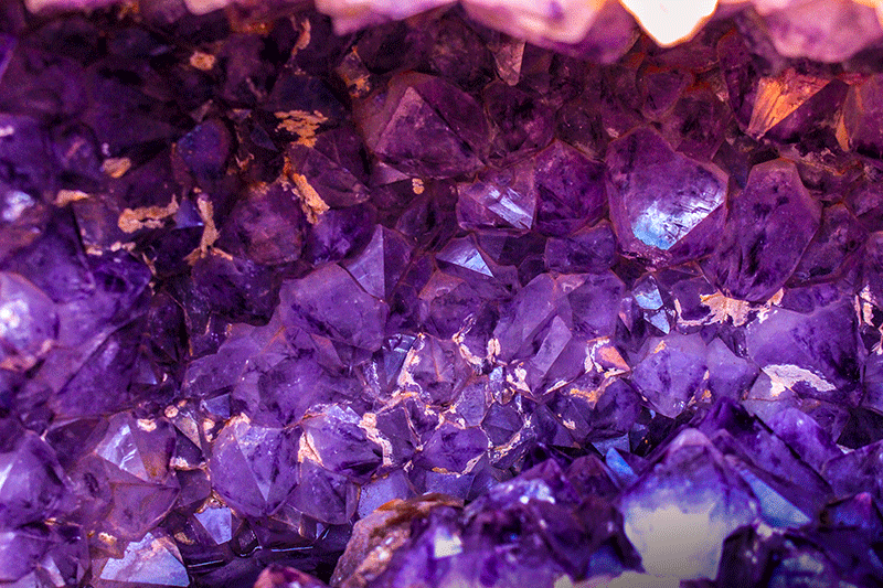
While red or blue are fairly evocative, purple is a more mysterious and less immediately intuitive colour.
Purple, sitting between red and blue, conveys a sense of calm, creativity, mystery, wonder, and meditation. It is also considered to evoke royalty, nobility, and luxury. Depending on the shade, purple can also signify sensuality and romance.
On its opposing side, this colour is associated with sadness and mourning in certain aspects of our cultures.
Purple is apt when you wish to create an atmosphere of wellbeing and luxury, or of sensuality and femininity. This noble colour can serve high-end brands through its sense of prestige — particularly when paired with black, which is sober, powerful, serious, and elegant.
A few brands that use this colour, by way of example: Syfy, Milka, Cadbury, Yahoo, Quality Street.
Pink: energy, romance, cheerfulness, and femininity
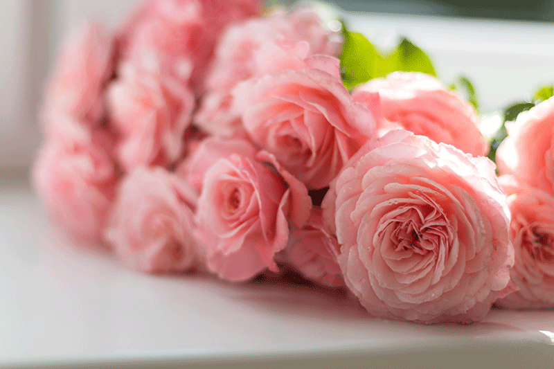
In modern Western culture, pink is very often linked to femininity (with the exception of certain countries such as Belgium, where this shade is more associated with masculinity).
Sitting between red and white, the shade pink evokes excitement, romance, cheerfulness, and energy — all without the aggressive edge of red. This colour and its youthful, playful quality can add light, calming touches to your visuals.
On its opposing side, pink evokes excessive optimism, even naivety, and idealism.
Brands targeting a female audience often use this shade. However, a touch of pink can also enhance the masculine quality of a brand image, or even offer a disruptive element in the marketing landscape to help you stand out.
Touches of pink on your website or in your advertising visuals can reinforce the sense of power you wish to project through your brand image.
A few brands that use this colour, by way of example: Barbie, Hello Kitty, Meetic, Contrex, Bourjois Paris.
Black: power, elegance, mystery, and professionalism
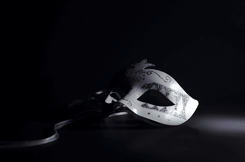
Black is a particularly paradoxical shade. In modern Western cultures, it is associated with mourning, darkness, and death. Yet it is also a powerful colour that conveys professionalism, sobriety, strength, and sophistication.
Many brands seeking to establish a premium image draw on black, with its blend of mystery and elegance.
Black is an excellent shade for a background that will make your key elements stand out, and lends itself perfectly to a clean, minimalist design.
It can also be used to accentuate certain elements on a light background, such as call-to-action buttons.
However, take care not to overdo the black, which could make your visuals or your site too dark and therefore counterproductive. Also note that white text on a black background, if it is too extensive or too tightly set, can strain the eyes and tire your readers.
A few brands that use this colour, by way of example: Adidas, Nike, Dior, UPS, Sony, Mac, Puma, Chanel, BlackBerry, Desigual.
Brown: earth, stability, authenticity, and nature

The colour of soil and of the Earth, brown evokes a natural atmosphere, much like green. Brown carries an "organic" feeling. You can use it to create an impression of simplicity, stability, pragmatism, and wholesomeness.
This shade lends itself well to artisan and local produce and to brands wishing to project an authentic, natural, and ecological image.
Take care, however, to avoid a visual that might suggest mud or dirt with this colour; it requires moderate use.
It is worth noting that brown can be used to accentuate certain elements — for example by pairing it with orange. An orange call-to-action button might be framed with a brown shadow, making it stand out more effectively on your site or advertising visuals.
A few brands that use this colour, by way of example: Timberland, Nespresso, UPS, M&Ms.
White: purity, innocence, clarity, and simplicity

White evokes everything that is good and wholesome, in contrast to the negative side of black. White conveys a sense of purity, innocence, clarity, and simplicity.
It is worth noting that in Eastern cultures, white is instead associated with death, and in places such as India it is the colour worn by those in mourning.
Equally, beware of an excess of white: this gives an impression of sterility, emptiness, coldness, and loneliness.
On the other hand, it is a shade that pairs perfectly with every other colour and helps amplify the atmospheres created by other colours. White is consequently very widely used and highly valued.
For a brand with an eclectic image, all shades will combine beautifully with white. Paired with blue, white reinforces the natural, aquatic quality of that colour. Paired with black, white will reinforce the prestigious, sophisticated feel of a design.
A few brands that use this colour, by way of example: Wikipedia, Mr Clean, Wiko, Lactel.
Combining the traditional meanings of colours with your own brand identity
Each colour carries various meanings in the collective imagination. We can see that this symbolism varies from country to country, sometimes conveying completely opposite meanings (as with white — purity and marriage on one side, mourning and death on the other). It is therefore important to take this into account for a brand looking to expand internationally. Moreover, by varying the shade of a colour, you will achieve different atmospheres, to be modulated according to the ideas you wish to evoke.
In marketing, and in web marketing, understanding and grasping the meaning — indeed the multiple meanings — of each colour is essential for clearly defining your image and conveying the values that reflect you. Whether applying colours to your brand image in line with the collective imagination, or conversely distancing yourself from convention as part of a disruptive strategy. This is the case, as we have seen, with touches of pink — traditionally associated with femininity — which can work for a menswear brand, for example. The key is above all to find the right balance between traditional meaning and boldness, to achieve a result that reflects you and sets you apart from the competition.
Finally, beyond choosing the right colours, you must also think about selecting the right tones and combining them as effectively as possible. For that, there are colour palette generators to help you produce a website design with beautiful, well-matched colours.
We hope this overview has satisfied your curiosity about the use of colour in web design and website creation.
(Article freely translated and adapted from Jen Reviews)
Have a similar project?
Let's talk it over in 15 minutes. No sales pitch, just a technical chat.