iOS 10 graphic guide: 29 important elements to consider
iOS 10 from Apple primarily introduced changes from a consumer perspective: widgets, Siri, notifications…
For designers, the only visible changes are bolder titles and a greater use of cards.
For designers and app or site creators working with a third-party service provider, a review of iOS 10 and its features can be useful. It is an opportunity to revisit the elements where iOS has refined itself over time.
The platform of maturity
iOS has evolved over the years. In its 9th update, Apple notably introduced a new typeface called San Francisco, 3D Touch, and multitasking on iPad.
In Xcode, you will find Stack Views — a handy tool (and far less complex than Auto Layout) that allows you to create a responsive application that adapts to any screen size. Apple thus encourages responsive design, which has become essential today.
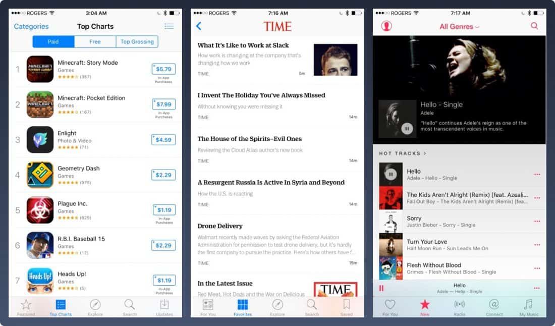
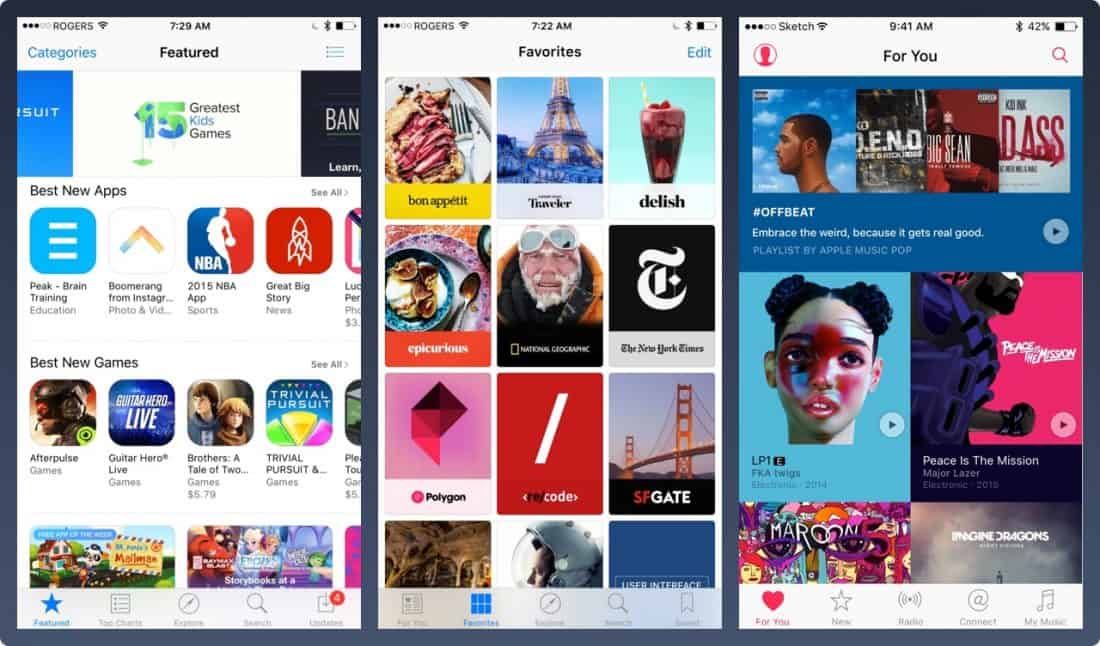
1. Responsive and multitasking layout
With the ever-growing number of different screen resolutions, failing to account for responsive design is a major mistake.
A flexible design and layout, capable of displaying additional menus when needed, is vital.
The GIF below shows how a design adapts across multiple screens, from iPhone to iPad Pro. The user interface expands rather than scales up.
For wider screens, such as the iPad or iPhone 7 Plus in landscape mode, a left-hand navigation panel replaces the usual tab bar.
2. San Francisco typeface
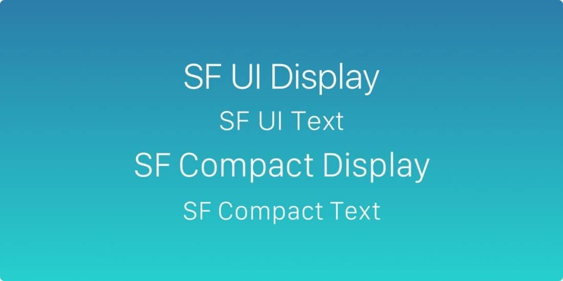
The default typeface is now San Francisco, Apple's own creation that made its debut on the Apple Watch.
This replaces Helvetica Neue, described by some as "the most loved typeface in the world". San Francisco was designed to look perfect on the screens of the world's most famous Apple devices.
3. Typeface adjustment
iOS automatically adjusts alignment and rendering for content using San Francisco. As a result, the typeface is always perfectly legible.
Additionally, the SF UI Font Fixer plugin for Sketch allows you to add correct spacing values quickly.
4. 3D Touch
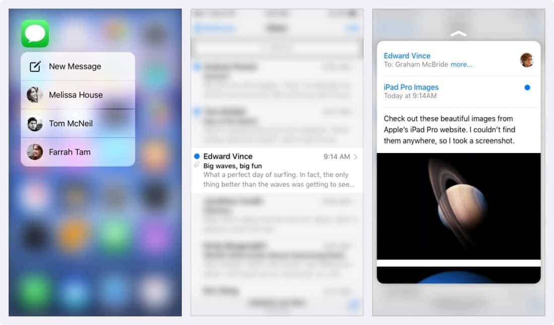
A new feature present in iOS is called 3D Touch, which allows users to quickly access various options inside and outside applications.
By pressing firmly on your application's icon, users can now expand the functions they use most often. Within an application, they can peek at their emails, and get a preview of a link's content before opening it.
Think of 3D Touch as keyboard shortcuts on computers; it allows users to speed up the tasks they perform frequently. You should therefore create shortcuts that will make users more productive.
But just like keyboard shortcuts, key features should not be exclusive to 3D Touch. Users must also be able to access them by using your application normally, without 3D Touch.
5. Points and pixels
Developers work in points; it is therefore important to understand the difference between points and pixels.
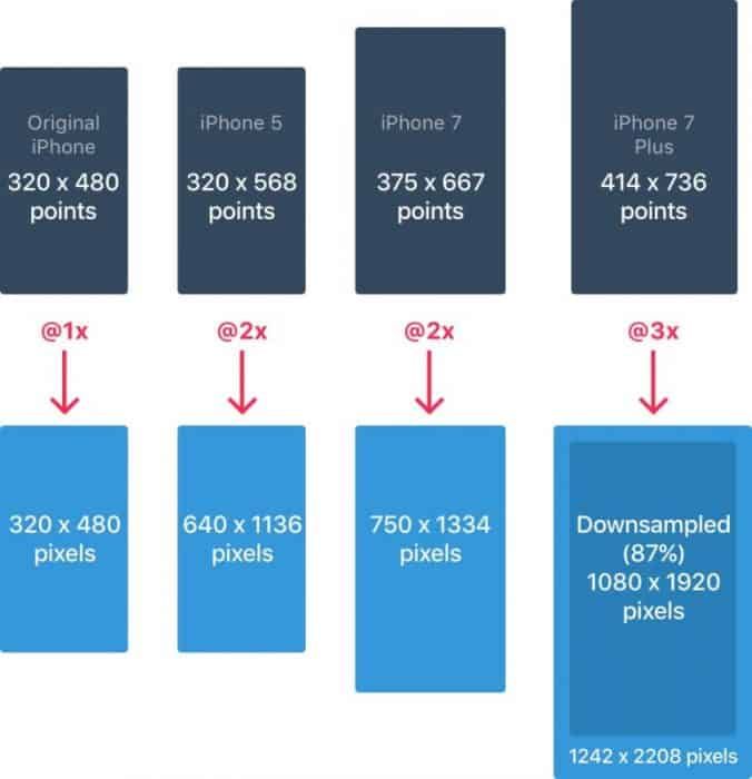
When the iPhone launched, the two values were equivalent: 1 point equalled 1 pixel.
With the arrival of Retina screens, 1 point became equivalent to 2 pixels. Depending on the model, the equivalence therefore differs. This is something to bear in mind when working with graphic designers or app developers.
6. iPhone resolutions
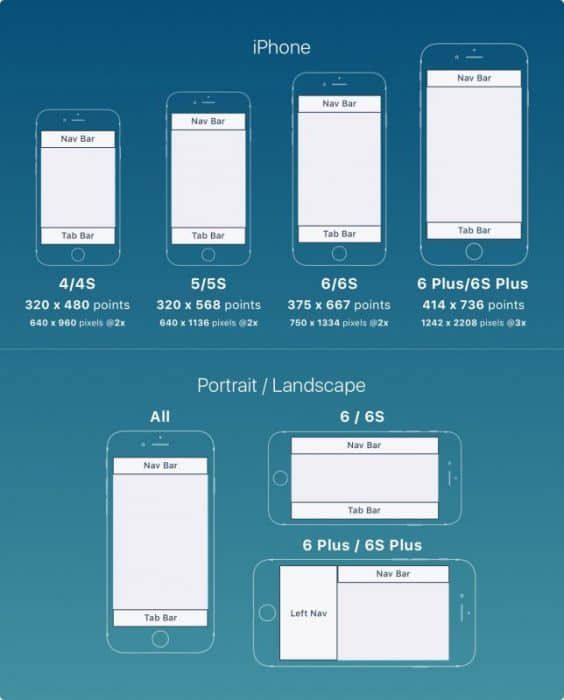
iPhones have 4 main resolutions: 320×480pt (iPhone 4), 320×568pt (iPhone 5), 375×667pt (iPhone 7), and 414×736pt (iPhone 7 Plus).
The layout does not scale but extends according to the resolution.
For example, the navigation bar only adjusts in width but retains the same height. The elements it contains therefore remain intact.
The iPhone 7 Plus is the only model to function more or less like an iPad in landscape mode — meaning a left-hand navigation panel replaces the lower navigation bar, the Tab Bar.
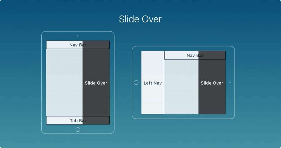
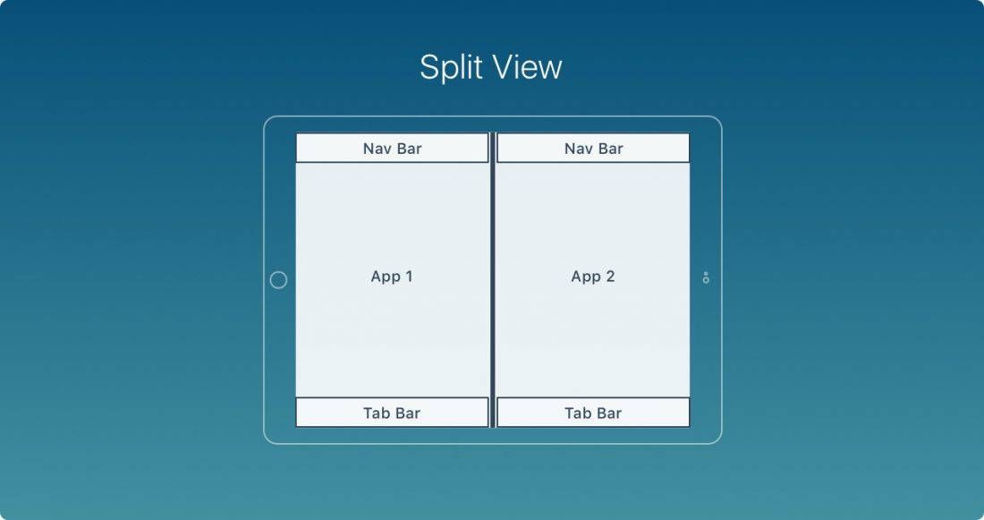
7. iPad resolutions
iPads have 2 main resolutions: 768×1024pt (iPad) and 1024×1366pt (iPad Pro).
The iPad features 2 new capabilities: Slide Over and Split View.
Slide Over is a panel that covers the right side of the screen without affecting the application's layout.
Split View allows users to use 2 applications simultaneously in landscape mode.
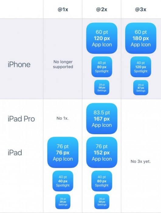
8. The application icon
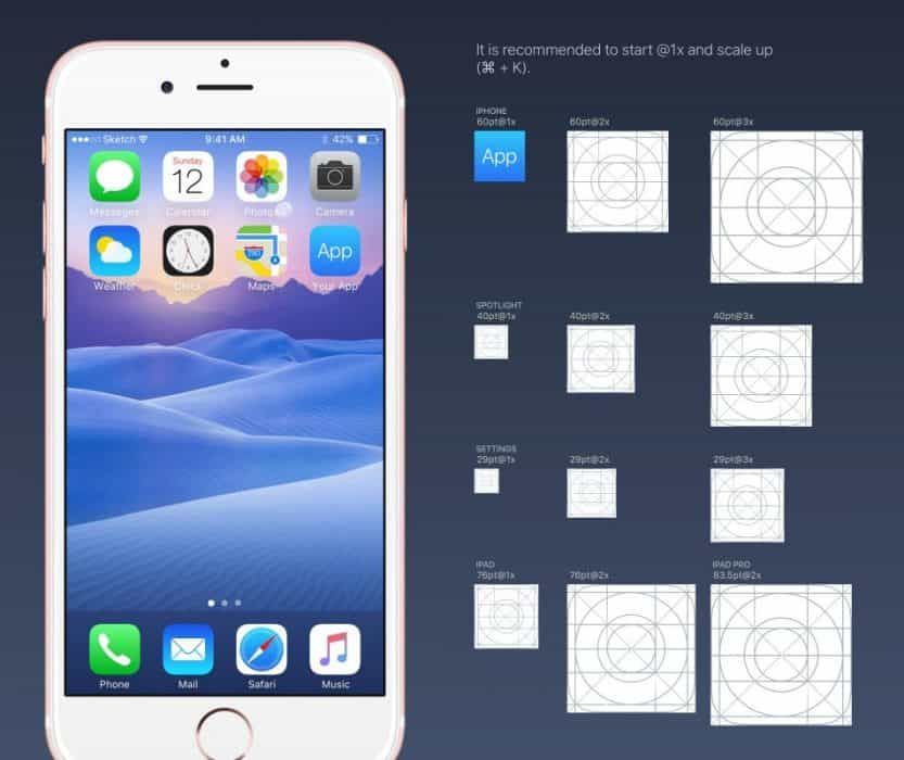
An application's icon is an important element of your visual communication. It is the first thing users see when they use your application.
The icon appears prominently in several places: Home screen, App Store, Spotlight, Settings.
iPhone no longer supports @1x resolutions; there is therefore no need to generate them. There are now only 2 resolutions for icons: @2x and @3x. And 3 types of icon: application icon, Spotlight, and Settings.
For iPad, @1x and @2x are used.
9. Squircle (superellipse)
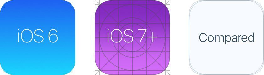
Since iOS 7, rounded corners have gone from mildly rounded to a squircle (superellipse) shape.
It is important to note that you should not export your icons with layer masks, or you may end up with black artefacts (the transparent areas of the image will turn black). Instead, export a square version of your icon to the App Store.
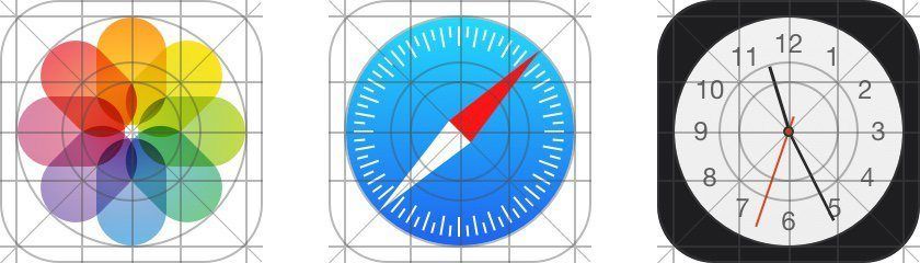
10. The icon grid
Apple applies a ratio to some of its icons. This ensures that the corresponding icons are optimal and well proportioned. While this is an interesting rule to follow, it is not mandatory. Even Apple does not apply it to all of its icons.
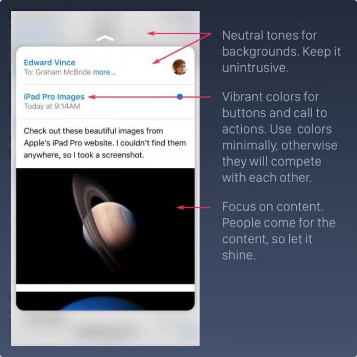
11. Colours
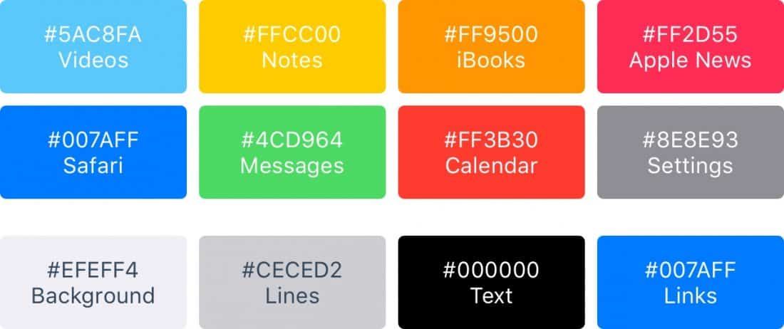
iOS uses vibrant colours to make buttons stand out. These colours tend to work well on both white and black backgrounds. Bear in mind that colours should be used judiciously and in moderation. They are primarily used for calls to action and minimal branding areas, such as the navigation bar.
As a rule of thumb, only 10 to 20% of your design should use colour. Otherwise, colours will compete with the content.
iOS frequently uses neutral colours for backgrounds and menu areas. Well-contrasted black text on a white background makes reading comfortable. Finally, a pastel blue helps buttons and links stand out.
12. Button sizes and type sizes
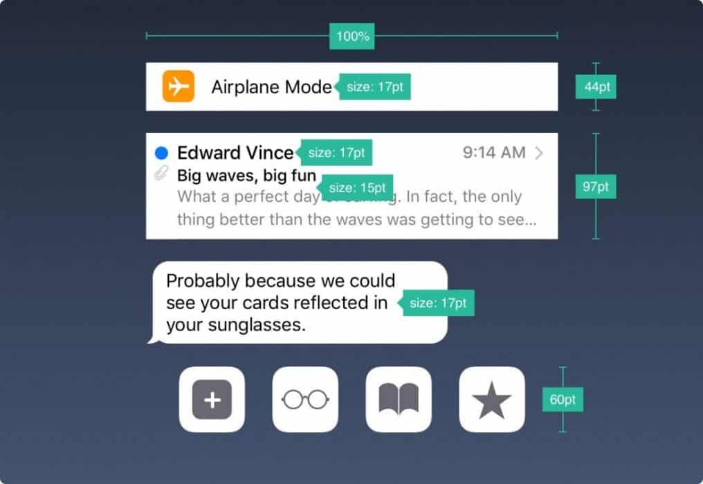
The general rule is 44pt for buttons, 12pt for small text, 17pt for body text, and 20pt+ for titles.
13. Spacing and alignment
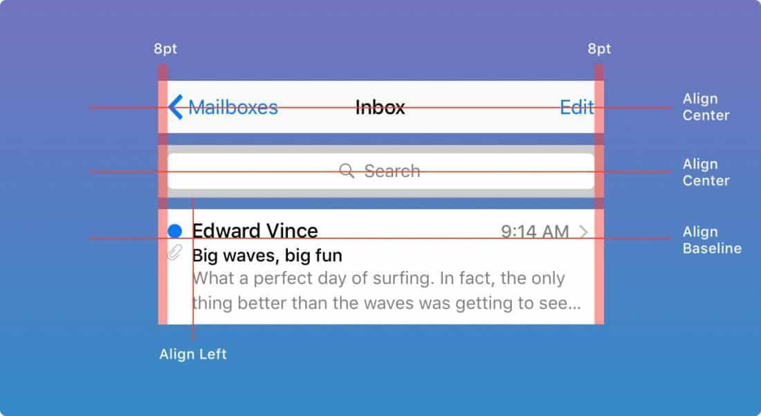
The general rule is a minimum margin and spacing of 8pt. This provides sufficient breathing room, making content easier to scan and read. Furthermore, elements should be aligned relative to one another, and text should sit on the same baseline.
14. The status bar
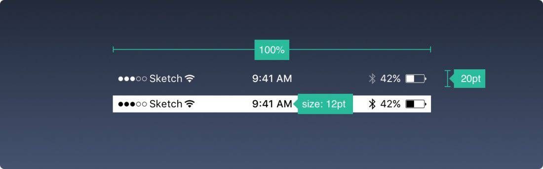
It is recommended to include the status bar whenever possible — preferably at all times. Users rely on it for important information such as signal strength, the time, and battery level. The text and icons can be black or white, but the background can be any colour and can merge with the navigation bar.
15. The navigation bar
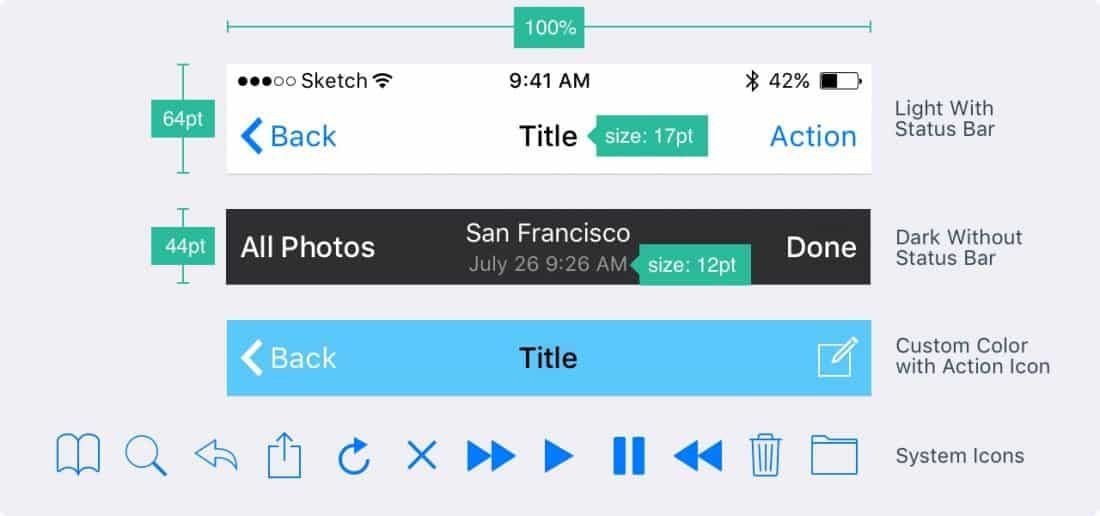
The navigation bar quickly provides information about the current screen. The left side can be used for a Back button to the previous screen, or a Profile or Menu tab. The right side is mainly used for Add or Edit buttons, for example.
Like the status bar, the background can be any colour and slightly blurred to ensure the text remains always legible. When the status bar is present, both backgrounds can merge.
16. The search bar
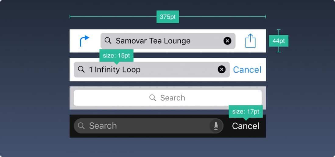
When you offer a large volume of content, allowing users to search it by text is a wise decision.
17. The toolbar
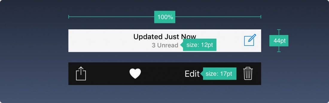
If you need more room for your buttons, you can add a toolbar.
18. The tab bar
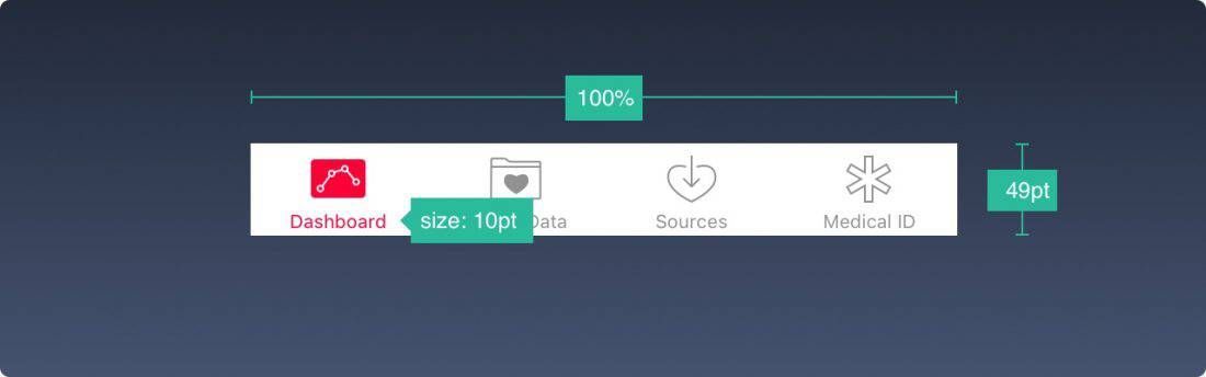
This is the main navigation menu, present across multiple screens of the application.
If you only have a few items, avoid a Hamburger menu (the icon representing 3 stacked lines, typically used to group less-used functions). Menus that remain permanently visible are always used more frequently, since what is apparent is always more impactful than what is merely implied.
It is also recommended to add text next to icons that users will not recognise at a glance. This is especially the case for icons using symbols that are not universally known or understood.
When inactive, icons are generally empty — only their outlines are visible. This means they attract less attention.

19. The table view
This is a very widely used layout that lists content. Most applications use a table view layout, as this arrangement can be very basic or highly customised.
20. The collection view
When displaying rows and columns in a grid, you will need a collection view. Offering a slightly more refined visual, it allows you to create almost any type of layout imaginable.
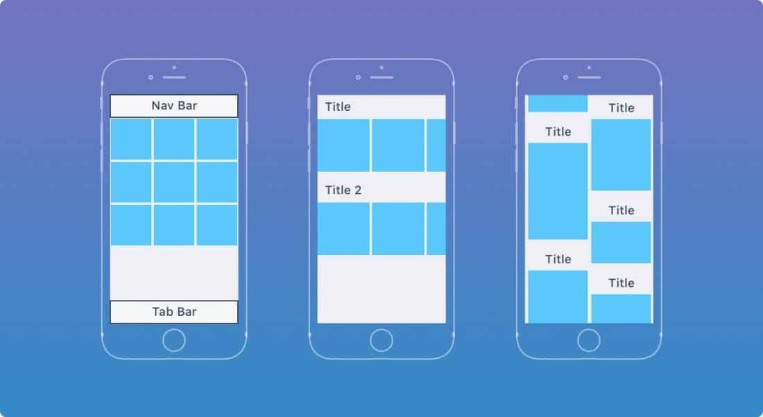
Here are a few layout examples. The possibilities are endless.
21. Dialogue boxes
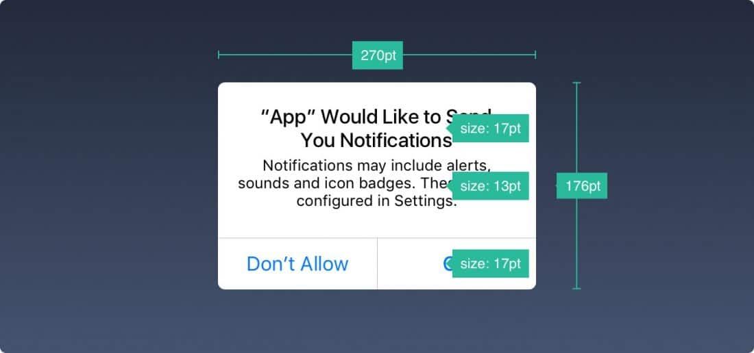
The alert pop-up conveys critical information. It should appear as infrequently as possible, and the close button should be clearly visible.
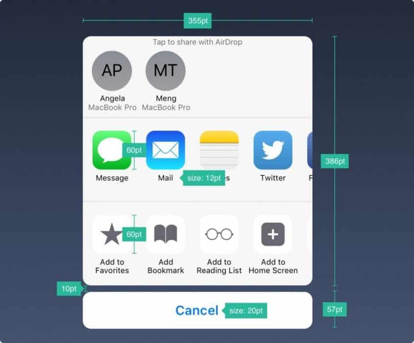
The share dialogue allows you to share content (text, images, links) via AirDrop, bookmarks, Mail, Facebook, or Twitter, among others. The appearance cannot be customised, but the options can.
When the information presented is fairly lengthy, you can add a panel that will take up the full screen size. Again, the action must be easy to cancel.
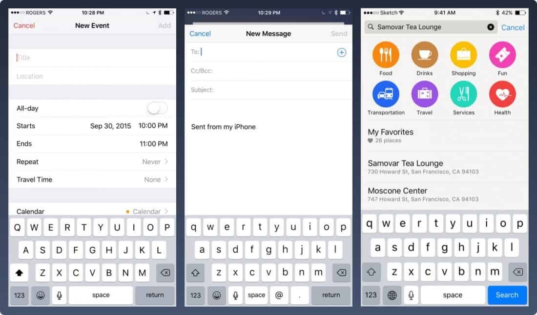
22. Keyboards
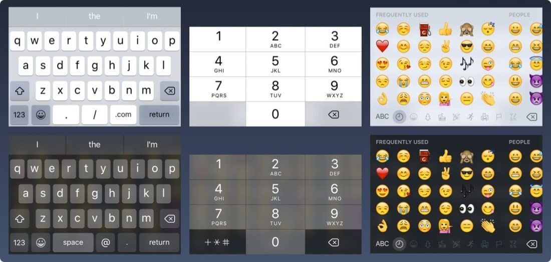
The keyboard is used for typing in text fields such as search, chat, or login. It is customisable in many ways — for URL, Email, Phone Number, or even Emoji fields. You can choose between light and dark themes. You can also change the name of the action button ("Return" being the default name).
23. The Date and Time Picker
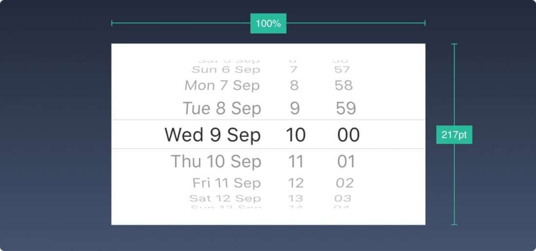
When you need to manage several options to choose from, you can use the Date and Time Picker. As its name suggests, it is particularly useful for dates, which require controlling 3 fields simultaneously.
24. The segmented control
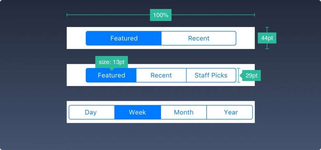
While the tab bar is present across all primary sections, the segmented control is used for secondary screens.
25. Sliders

Sliders are interactive control panels — less precise, but very useful for adjusting settings such as volume, brightness, or the progress bar of a video.
26. The progress bar

The progress bar, as its name suggests, shows the progress of an action. For example, it can show the advancement of a page loading.
Note that the height is customisable.
27. Switch
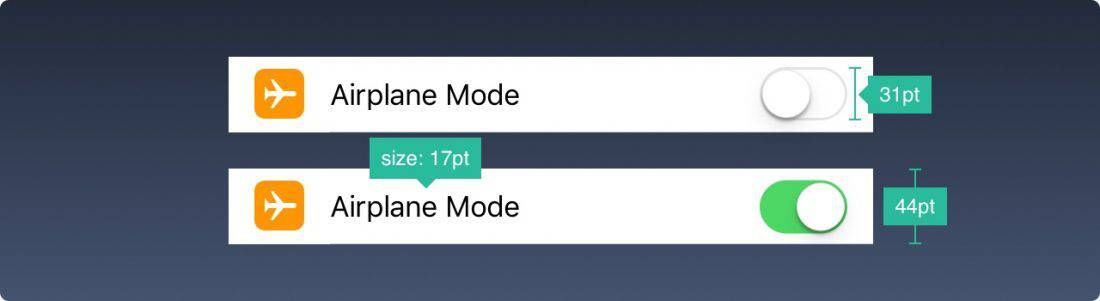
The switch allows easy toggling between active and inactive states. It should only be used for on/off actions.
28. Stepper
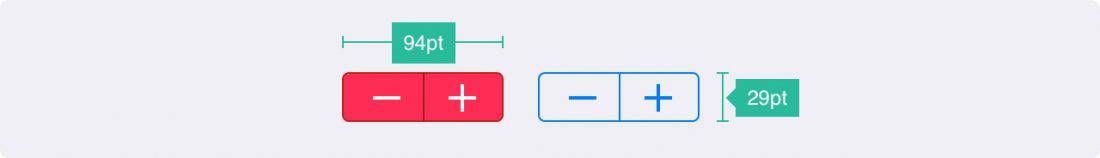
The stepper is slower but more precise than the slider. It allows users to increase or decrease a value one step at a time. The borders and colours are customisable.
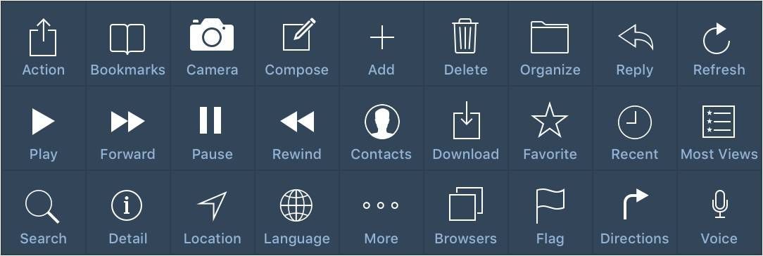
29. iOS icons
These are the native icons of iOS. Being so widely used, they are instantly recognised by users. Using them for actions other than their intended purpose will confuse users. It is therefore important to be aware of their standard usage on iOS.
When you are designing — or having designed — a new icon that does not correspond to these, it is important to understand which symbols make sense universally. When in doubt, it is always preferable to accompany your icons with short text of 10pt or more.
(Photos and free translation from designcode)
Have a similar project?
Let's talk it over in 15 minutes. No sales pitch, just a technical chat.