50 typography terms to know for optimising your website content
The world of typography is full of specific terminology. Whether you are trying your hand at building your own website or working with a professional web designer, knowing these terms could be a great help.
Because behind an apparently complex surface, these terms reveal knowledge that can help you optimise the readability and appearance of your website. And as we saw in a previous article (19 colour palette generators to simplify web design), the appearance of your website is crucial for catching the eye, encouraging an internet user to stay on your site, and even to return at a later date.
Here, then, is a list of 50 terms on the subject that can be useful to know:
1. Kerning
Kerning represents the space between two letters. Unlike letter-spacing (tracking), which places an equal amount of space between every letter, kerning varies depending on the pair of letters being spaced.
Kerning matters on a website. Indeed, it can subtly affect how internet users perceive the text. If kerning is not applied, certain letters will appear too close together or too far apart.
2. Tracking (Letter-spacing)
Tracking is therefore an equal amount of space between all letters.
If you need your text to cover more space (on a button, for instance), increasing the tracking may be the solution.
3. Leading (Line-spacing)
Leading is the space between two lines of text.
Good leading helps to make the reader's journey down a page more fluid, improving legibility.
4. Glyph
A glyph is the most basic unit of a typeface that can carry meaning. This includes letters, numbers, punctuation marks, and other characters.
If you plan to offer your website in multiple languages, you should ensure that the chosen typeface includes all the glyphs for the languages concerned.
5. Serif
The serif is the line that appears at the foot of a character. In typography, you will mostly hear the term Serif used to name a specific style of typeface.
Traditionally, serif typefaces are used for body text, particularly in print. Thus, using a serif font for the body text on your website is a good idea if you want to evoke the feel of a printed page.
6. Sans-Serif
A sans-serif typeface presents no line at the foot of its letters.
Sans-serif typefaces are perfect for headings. Their more "direct" and upright appearance draws the attention of internet users. Contrasting a sans-serif typeface with a serif one is a key principle in pairing fonts.
It should also be noted that sans-serif typefaces are easier to read for dyslexic readers.
7. Font
"Font" is the English term, but it is used just as readily in French. In typography, a font is the term encompassing the style, size, and weight of a piece of text. A well-known example of a font: Arial (sans-serif), or Times New Roman (serif).
The choice of font influences how internet users will perceive your text. Each font conveys a personality, an atmosphere, a tone. As an example, Comic Sans MS was initially very popular for its originality. Over time, through overuse in an attempt to liven up text, this font is now avoided as much as possible by professionals, as it gives the impression of unserious or even childish writing. Every font therefore has a subtle (but important) effect on how internet users will receive your message.
8. Font family
A font family is a group of fonts with similar glyphs. A font family may thus contain a sans-serif font, the same font with serifs, or offer an old-style and a modern variant.
For example: Arial, Arial Black, Arial Narrow, Arial Unicode MS, and a few other variants make up a font family.
Using several fonts from the same family is a good way to add harmonious contrast between your headings and body text.
9. Point size
The point size represents the relative size of a font.
If someone mentions Times New Roman point 12, the 12 refers to the size of the text.
Choosing the right font size is one of the easiest actions you can take to improve the readability of a web page.
10. Weight
In typography, weight concerns the thickness of letters. Text can be, in order of thickness, "light", normal (regular), bold, or black. There are many other weight variants in typefaces.
Each font may offer various weights, and choosing the right weight can be essential to the readability of your website.
11. Roman
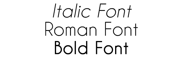
In typography, roman is the term used for a typeface with a "normal" appearance, as opposed to italic or bold styles.
This is obviously the text style you will use for the majority of your online content. It is naturally more readable and comfortable for internet users than italic or bold.
12. Italic
Italic describes a font that is slanted to one side.
Italics are primarily used to emphasise certain terms and should be used sparingly on your website, so as to preserve their impact.
13. Bold
Bold describes a font that is thicker than average.
Like italic, bold should be used sparingly on a website, reserved only for the most important words or for headings.
14. Baseline
The irony with this term is that its English version is generally better understood than its French equivalent. The baseline is the invisible line on which characters "sit".
The baseline provides a reference point for discussing other aspects of typography, such as the descender or x-height.
15. Cap Line
The cap line is, like the baseline, an invisible line above the letters, which they do not exceed.
Like the baseline, the cap line is primarily a reference point for discussing other typographic elements such as the ascender.
16. Midline
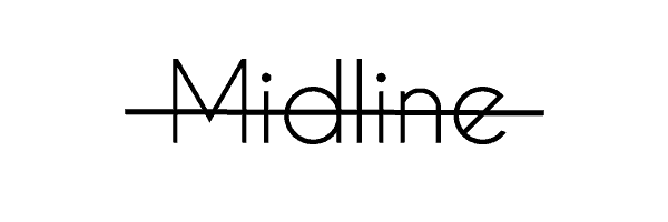
The midline is the line at the exact midpoint between the baseline and the cap line.
The midline is also an important concept for understanding the ascender.
17. X-height
The name speaks for itself: it refers to the height of the lowercase letter x in a typeface.
The x-height provides a reference point for describing the size ("tall" or "short") of a typeface.
18. Stroke
In typography, a stroke is a vertical line within a letter.
The way the stroke ends determines whether the typeface is serif or sans-serif.
19. Stem
Stem is the term for the main vertical stroke of a letter.
20. Cross stroke
This is the term used for the point where a stroke crosses a stem. This is the case in the letters f and t. Similar to an arm, the cross stroke differs in that it passes completely through a letter, whereas an arm is a horizontal stroke that does not bisect the letter.
21. Descender
The descender refers to any letter that extends below the baseline. This is the case with the lowercase letters g, j, q, y, and p, which therefore have a descender.
22. Ascender
The ascender refers to any letter that rises above the x-height. For example, the lowercase letters b, f, d, k, and h.
23. Ascender line
In typography, the ascender line is the space between the midline and the top of the character.
24. Ligature
A ligature is the combination of two letters into a single glyph. For example, the œ in "œuvre" or "cœur".
If you plan to include text on your website that features ligatures, you should check that they work correctly with the fonts you are using.
25. Joint
The term joint refers to the point where a stroke meets a stem.
26. Vertex
In typography, a vertex represents the meeting point of two downward-pointing strokes. For example, the point at the bottom of a V, or both points of a W.
27. Apex
The apex is the inverse of the vertex. It refers to the meeting point of two strokes, forming a point, at the top of a glyph. For example, the point at the top of an A.
28. Crotch
In typography, crotch is the term for a vertex (the meeting point of two strokes forming a point) on the inside of a letter. This is the case for the inner point of the letter y.
29. Shoulder
The shoulder is a curved part of a letter that extends from a stem. For example, it can be found in the letters n, m, and h.
30. Arm
In a glyph, an arm is a long horizontal stroke, such as the top strokes of the letters E, F, and T, or the bottom bar of the L.
31. Bar
The term bar refers to a short horizontal stroke, as in the letters f, A, and t, for example.
32. Bowl
The bowl is a curved or oval stroke, closed, that encloses the counter. It can be found, for example, in the letters b, e, and o.
33. Counter
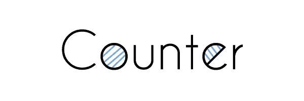
In typography, the counter represents the white space within glyphs such as the letters O or e, for example.
Paying attention to counters helps to correctly adjust the kerning, leading, and tracking of a piece of text.
34. Aperture
Literally translated as "opening", the aperture refers to an open counter, as in the letters u or C.
35. Terminal
The terminal, as its name suggests, refers to the end of a stroke that has no serif. It often has a rounded or tapered shape.
Well-crafted terminals are a way of adding interest to a sans-serif typeface.
36. Swash
A swash is the addition of a stroke onto a glyph as decoration and embellishment.
To decorate a piece of text and give it a fantastical feel, a few well-placed swashes can do the job.
37. Arc of stem
This is the term for a curved stroke in the continuation of a straight stem. For example, the bottom of the t in certain typefaces, or the top of the f.
38. Diacritic
In typography, a diacritic is the accent accompanying a letter to modify its corresponding sound. For example, the accent in "rêve", without which the word would be pronounced "reuve".
Most typefaces include diacritics. However, it is always worth checking that your chosen font can correctly display all types of accent (from the simple é to the rarer ö).
39. Text font
A text font refers to a category of fonts recognised for working better at small sizes. This makes them an ideal category for body text.
40. Display font
A display font refers to a type of font designed to be optimal at large sizes. This makes it a perfect font type for headings (H1) and subheadings (H2, H3, etc.).
41. Typographic colour
Typographic colour actually refers to the relative lightness or darkness perceived by the eye at first glance. It is thus the impression produced on the reader's vision by an overall view of your text.
Depending on the leading, kerning, tracking, font, and many other variables, your blocks of text will appear more or less dark. When you create or add content to a page, make sure that the headings and body text display a visible difference in typographic colour.
42. Contrast
In typography, contrast is the perceived difference between fonts. Contrast depends on context, but commonly involves recurring elements such as size, weight, family, and style.
In terms of a website, appropriate contrast between the different fonts on your page will optimise the readability of your content.
43. Body copy
Body copy is the main part of your text, as opposed to headings and subheadings.
Be particularly careful in your choice of body copy font, which must be highly appealing and readable. This is, after all, the part of the text that internet users will read and therefore spend most of their time on. Optimal presentation and maximum readability are therefore what you should aim for.
44. Heading
A heading is the text that defines the different sections of a page. A heading typically uses a different font and font size from those of the body copy, to make the distinction as clear as possible.
A heading is essential for breaking up body copy that is too long (exceeding 2–3 paragraphs) or when you wish to show a clear separation between two parts of a text.
45. Subheadings
Like headings, subheadings also serve to break up text to make it visually clearer and more appealing. As the "sub" implies, these are smaller than the main heading and should appear after it in body copy.
For genuinely long pages or articles, subheadings are useful — even crucial — for creating clear, well-spaced sections. In addition to making text more appealing to the internet user, segmenting your text with subheadings allows them to reach the section of text they are interested in more quickly. They need only read the subheadings to see which one contains the information they are looking for.
46. Hyphen
The small horizontal line that needs no introduction, the hyphen is primarily used for compound words and when a word is broken at the end of a line.
47. En-Dash
The en-dash is a horizontal dash approximately the same width as a capital N in a given font. In general, in word-processing software, the regular hyphen (-) automatically changes to an en-dash when it appears between two words. In some cases, two hyphens must be typed consecutively (—). The en-dash is typically used between two dates (1992–2016).
48. Em-Dash
The em-dash is a longer dash. It is primarily used to separate two ideas within a sentence (similar to commas) or to add supplementary information (similar to parentheses).
Typing three hyphens in WordPress automatically generates an em-dash. Outside WordPress, in word-processing software, this dash can also be obtained by pressing Alt Gr and the – key on the numeric keypad simultaneously.
49. Alignment
Alignment describes the position of text relative to the margin (whether in print or digital form).
There are generally three types of alignment: Align left, Centre, Align right. Left alignment is the default and is suitable for any language read from left to right.
50. Justified
In typography, there is a fourth type of alignment: justified text. In this case, the text is aligned and straight on both the right and left sides.
Justified text is not always recommended for a website. It is primarily a text alignment used in novels and newspapers. However, if the aim is to create a website with an aesthetic similar to a book, justified text can be a suitable format.
Important typography terms for effective content
The technical terms of typography present concepts that are fundamentally useful in the context of websites.
Having some knowledge in this area will allow you to better understand the world of web design, to influence the mood of the internet users who read your content, and to optimise the impact of your most important content. We hope this list of 50 terms in both French and English will help you see more clearly in this field — and draw the best from it to offer appealing content on your site, because well-crafted and well-targeted content is one of the key success factors for a website.
(Freely translated from Elegentthemes; Images from Elegentthemes and Wikipedia)
Have a similar project?
Let's talk it over in 15 minutes. No sales pitch, just a technical chat.